A color story is the small set of colors that ties a board, an outfit or a wardrobe together, plus a rough idea of how much of each to use. It is the difference between a collection of nice things and a look. Designers build one for every collection; for your own clothes, it is the fastest way to make pieces work with each other.
Palette versus color story
A palette is a list of colors. A color story gives each color a job. Usually that means:
- A base: the color you wear most, often a neutral like navy, camel, charcoal, ecru or denim blue.
- A supporting color that goes with the base and adds depth.
- One or two accents, used in small amounts: a bag, shoes, a scarf, jewelry.
Two boards can share the same five colors and look completely different because the proportions are different. Camel as the base with a touch of black reads soft; black as the base with a touch of camel reads sharp.
How to pull colors from your images
Start from a board rather than from a color wheel. The colors you are already drawn to in photos are a better guide than theory.
- Look at the board as a whole. Step back, squint, or take a photo of it and blur it. Small details disappear and the main colors stay.
- Sample, don't guess. In the mood board maker, the colors panel samples the actual pixels of each pinned image and groups them into the main colors, weighted by how big each image is on the board. You can copy the hex codes or pin them as paint chips.
- Cut to five or six. Merge near-duplicates. Two slightly different beiges are one color for planning purposes.
- Name them. "Sea glass" and "old paper" are easier to remember in a shop than hex codes.
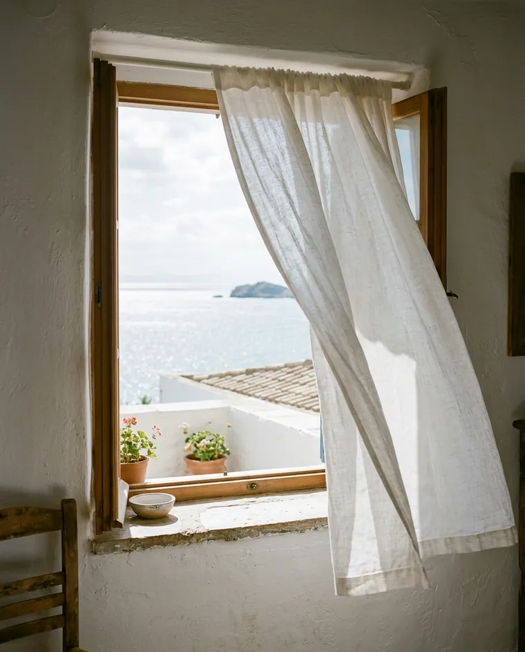
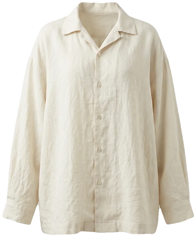
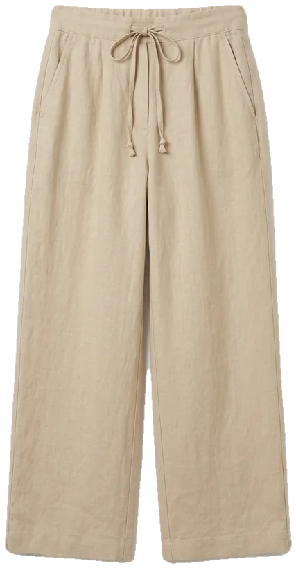
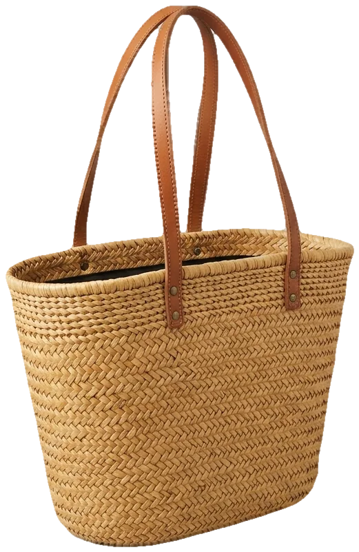
salt air, linen, nothing ironed
How much of each color: a rule of thumb
A widely used guideline, borrowed from interior design, is the 60-30-10 split: about 60 percent of the look in the base color, 30 percent in the supporting color and 10 percent in the accent. It is not a law, and many great outfits ignore it. It is useful as a starting point when something feels off and you cannot say why.
Here is what that looks like with two of the templates:
Coastal linen
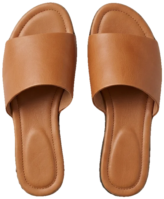
Sand trousers and an ecru shirt carry most of the look; the deep blue shows up in a bag, a scarf or sandals.
Dark academia
Brown tweed leads, a near-black knit supports it, and oxblood loafers are the accent.
In an outfit, the base is usually the largest garment (a coat, a dress, trousers), and the accent is something small. If an accent color starts taking over, swap its garment for a smaller piece in the same color.
Warm, cool and contrast
Two things decide whether colors sit together comfortably: temperature and contrast.
Temperature. Most colors lean warm (toward yellow and red) or cool (toward blue). Neutrals do too: camel and cream are warm, charcoal and pure white are cooler. A board where all the neutrals lean the same way tends to look calm. Mixing is fine, but it reads as a choice, so make it one on purpose.
Contrast. This is the difference between the lightest and darkest colors on the board. Low-contrast stories, like oatmeal, camel and taupe, look soft and quiet. High-contrast ones, like black and white with one red, look graphic. Neither is better, and personal coloring matters here: many people find that outfits echoing the contrast between their own hair, skin and eyes look more natural on them.
Check your color story against your own coloring
A palette that looks perfect on a board can look different next to your face. Colors shift with fabric, light and the skin next to them. The only reliable test is seeing the colors on you: hold fabrics up to your face in daylight, try pieces on, or use a virtual try-on with your own photo.
See your color story on your own photo
Upload a photo of yourself and a photo or shop link of a garment; FitInView shows you wearing it, so you can see a color next to your own face before buying.
Your first try-on is included with a free account. No card needed.
Using hex codes when you shop
Hex codes are handy for keeping a palette consistent across a board, but treat them as a guide. Screens show colors differently, product photos are edited, and the same dye looks different on wool, cotton and silk. Use the codes to compare options side by side, not as an exact match.
Shop filters work better with names than codes. Most stores filter by broad color families, so "beige", "brown" and "blue" will get you closer than "#C19A5B".
A quick color story checklist
- Five or six colors at most, each with a job: base, support, accent.
- Neutrals that agree in warmth, or a deliberate mix.
- A level of contrast that suits the mood and you.
- At least one accent small enough to be optional.
- Names you will remember when you are standing in a shop.
Want a ready-made starting point? Each of the mood board templates comes with its own five-color story. Or go back to the beginning with how to make a fashion mood board.